Great Danish Designers 101: Kai Kristiansen
Renowned Danish designer Hans Wegner once said: “A chair is to have no backside. It should be beautiful from all sides and angles.”
By those criteria, we can safely say that Kai Kristiansen designed a lot of beautiful chairs. But it wasn’t just chairs. Kristiansen was also known for his desks, tables, and sideboards. Like many Danish designers in the mid-century period, he worked primarily with teak and rosewood. He also followed the Danish tradition of “practicality and fitness for purpose.” (Scandinavian Modern Home)
Kai Kristiansen from A to “Z”
Kristiansen was born in Denmark in 1929. He trained at the Royal Danish Academy of Fine Arts (Det Kongelige Danske Kunstakaemi) and finished his apprenticeship as a furniture maker in 1948. He soon found employment as a journeyman cabinetmaker with Kaare Klint, a man sometimes referred to as the father of modern Danish furniture design. (http://bit.ly/1O4PfrW)
Klint’s design philosophy was based in modernizing classic forms. He took inspiration from traditional furniture forms and craftsmanship, but saw the need for a more progressive and humanistic approach to design. To that end, Klint devised a set of data based on average human measurements, proportions, and dimensions that he believed should be used as a benchmark in all furniture design. (Scandinavian Modern Home)
Emulating his mentor, Kristiansen would become known for excellent craftsmanship and innovative, human-centred design. He set up his own design shop in 1955 where he worked with a range of manufacturers to create furniture “defined by clean lines and a perfect balance of form and function.” (http://bit.ly/1O4PfrW) In fact, it was one such business relationship that led to Kristiansen’s most famous design.
Kristiansen created the #42 chair—also known as the “Z chair”—in 1956 while working with Schou Andersen, a family-owned company established in 1919 and still in operation today. We may never know what exactly the company asked for when it contracted Kristiansen to create a new dining chair, but we can imagine their response when they first saw the #42:
The design is innovative with striking angles and the clean lines Kristiansen was known for. It has the “floating” quality common to Danish mid-century modern furniture, but still appears grounded and solid. And the excellent craftsmanship is apparent from just one glance.
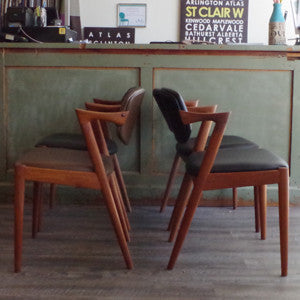
Considering it from all angles, as Wegner suggested, we can see it is indeed beautiful no matter which way you look at it:
Images from VHB's current collection.
The human element is also present in the “Z” chair, seen in the pivoting backrest that adapts to each individual’s seating position. Being both comfortable and attractive, the chairs are versatile enough to work as dining room furniture and armchairs in a living room—adding the “functional” portion of the “form and function” equation.
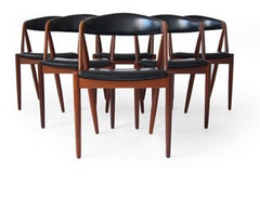
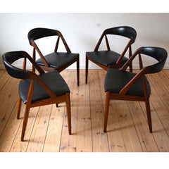
Comfort and style abound in Kristiansen’s other dining chairs, like the gorgeous Model 31, also designed for Schou Andersen (and also in-stock at VHB):
Kristiansen’s #121 is another example of humanistic design. Considered one of his finest designs, the #121 lounge chair is minimalist and sleek, yet inviting and comfortable:
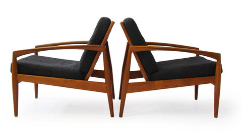 Image from scandinavianmod.com.
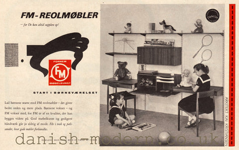
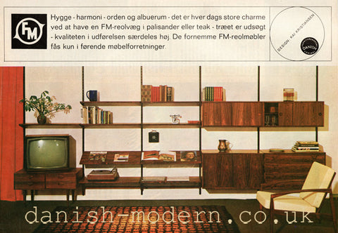
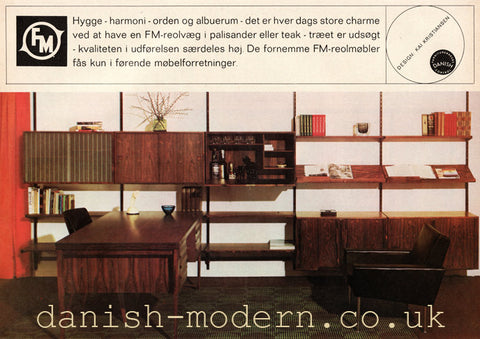
Another of Kristiansen’s most renowned designs provides ample evidence of excellence in both form and function. His FM-Reolsystem was first created for Feldballes Mobelfabrik in 1957. Later versions were produced by Fornem Mobelkunst. The FM-Reolsystem consists of a series of teak shelves and cabinets hung on wall-mounted metal uprights. Ads from that era show some of the many possible uses for the shelving unit:
Vintage advertisements from danish-modern.co.uk.
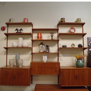
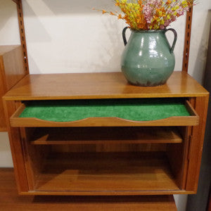
The FM-Reolsystem is visually stunning, but its functional elements make it even more appealing. The images below come from VHB’s own FM-Reolsystem, which is currently on loan to the production of popular TV series Heroes Reborn.
VHB’s version of Kristiansen’s design includes multiple shelves and three cabinets:
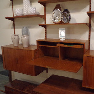
The centre cabinet, which also locks, includes an interior shelf and felt-lined drawer.
The other cabinets have sliding tambour doors, a moveable shelf, and a felt-lined drawer.
The wall unit could also be used in a home office, as seen in the advertisement below which showcases a Kristiansen desk along with the Reolsystem:
Kristiansen was known for desks which, like all of the pieces he created, included practical elements that flowed from the design. Perhaps his most recognized is the roll front desk, which included a round drawer and book shelves on the reverse side:

Images from deconet.com.
The EP 401 Rosewood desk also included shelves on the reverse:


Images from Design Addict.
More than just a prolific designer himself, Kristiansen loved supporting the work of his contemporaries. To that end, he organized a regional furniture fair from 1956 to 1965, and was the driving force behind the Scandinavian Furniture Fair from 1966 to 1970. (http://bit.ly/1YatRpS)
Kristiansen is recognized as one of the most talented Danish designers to emerge in the mid-century period. His designs, with their innovative aesthetics and clever practical elements, are highly sought-after today by both collectors and interior designers.
The next designer in our series: Poul Cadovius, inventor of the Royal modular shelving system. VHB currently has a Royal system in-stock, much like the one pictured here.
This post was written by guest blogger Crystal Smith of Pertingo Content Marketing.



Leave a comment